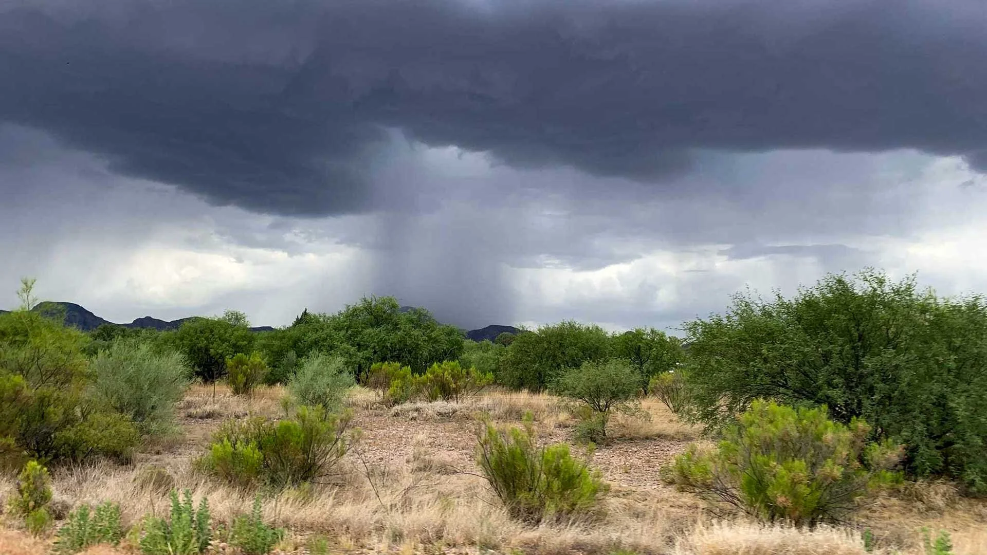
Extreme Rainfall Analysis: Arizona, USA & Global Trends
This project examines long-term precipitation patterns beginning with Arizona, expanding to 48 major U.S. cities, and ultimately scaling to a global dataset of 100 cities. Using Python (Pandas), Azure Blob Storage, and Power BI, raw daily precipitation records were cleaned, validated, aggregated, and transformed into analysis-ready datasets for geographic and time-series visualization.
The project demonstrates a scalable ETL workflow, progressing from a localized Arizona proof of concept to multi-decade U.S. analysis and global rainfall comparison.
Python • Pandas • Azure • Power BI • Azure Maps • ETL
The Data Journey
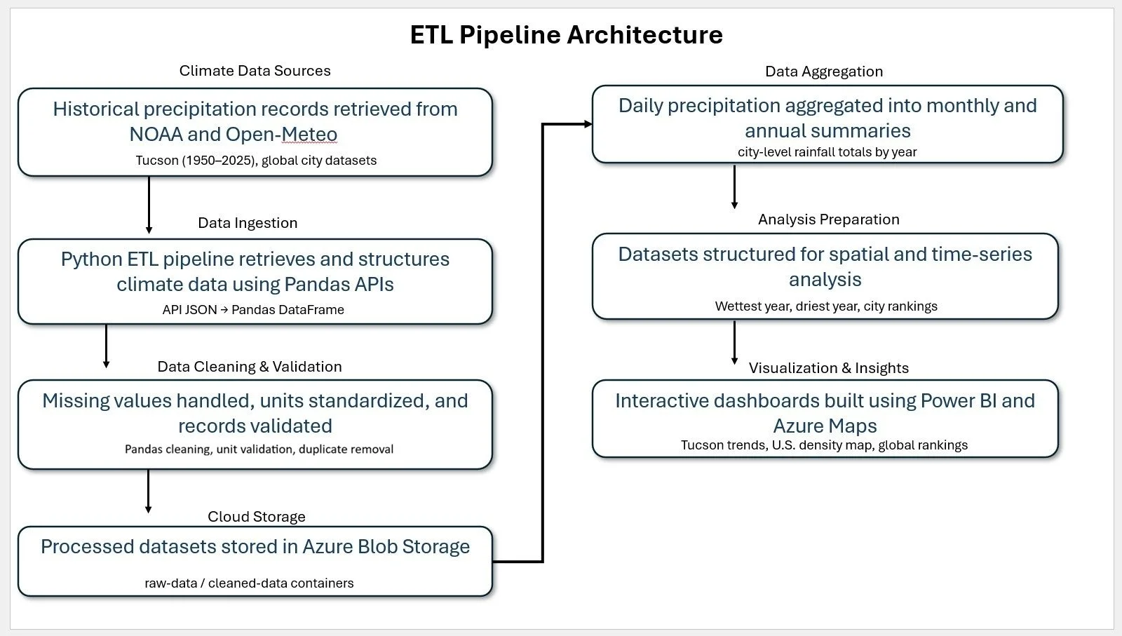
To ensure accuracy and scalability, I engineered a three-stage pipeline:
Collection & Cleaning: Used Python (Pandas) in Jupyter Notebooks to ingest raw NOAA data, handle missing values, and convert units (mm to cm).
Cloud Integration: Established an Azure ETL Pipeline to store analysis-ready datasets, ensuring the project could scale from local (Arizona) to global datasets.
Visualization: Connected the Azure environment to Power BI and ArcGIS to create interactive geographic heat maps and time-series analysis.
Architectural Foundation & Scalability
To bring this project to life, I established a cloud-native foundation using a free Azure account, leveraging Azure Blob Storage for data staging. This allowed me to move beyond local flat files and simulate a professional cloud environment.
The "Big Data" Reality
While this analysis focuses on precipitation, a truly comprehensive climate model would integrate:
High-Resolution Temperature Grids
GIS Flood Plain Topography
Satellite Imagery Data
Processing those additional layers would shift this project from gigabytes into the Terabyte or even Petabyte range. While currently operating within the hardware constraints of a local PC, the pipeline I've built is designed to be horizontally scalable—meaning the logic is ready for a full-scale Azure Data Lake or Synapse environment once high-compute resources are applied.

Tucson, AZ: Localized Historical Trends
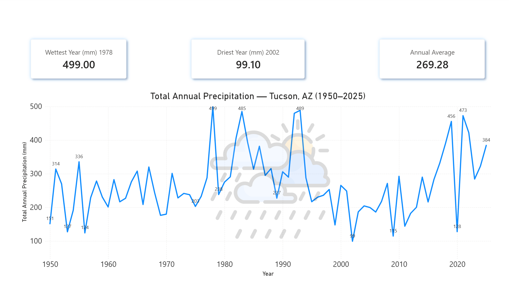
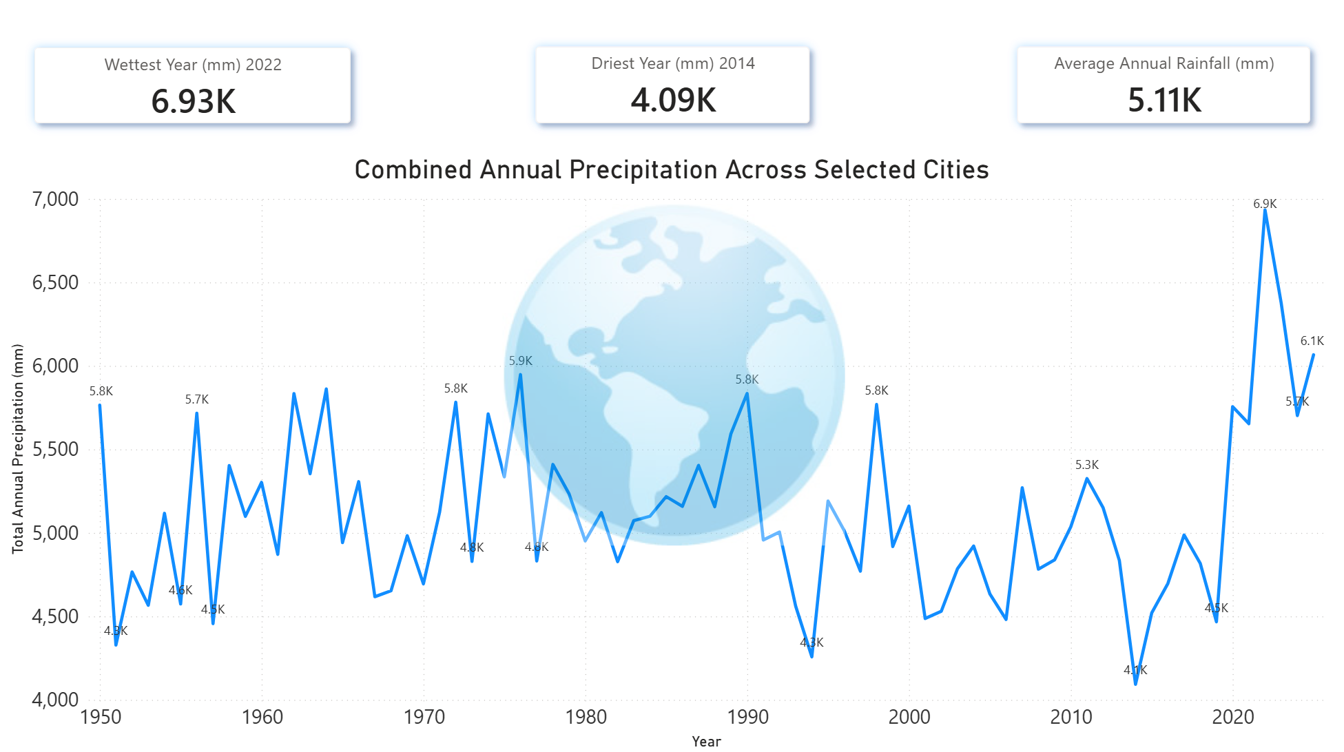
By utilizing Python (Pandas) for unit normalization, this time-series analysis highlights the high variability of desert precipitation. Standardized historical rainfall data shows a dramatic difference between the 1978 peak of 499 mm and the 2002 drought-year total of 99 mm, providing a baseline for examining extreme rainfall and long-term regional patterns.
Created in Power BI
USA: Geospatial Density (3D Azure Maps)
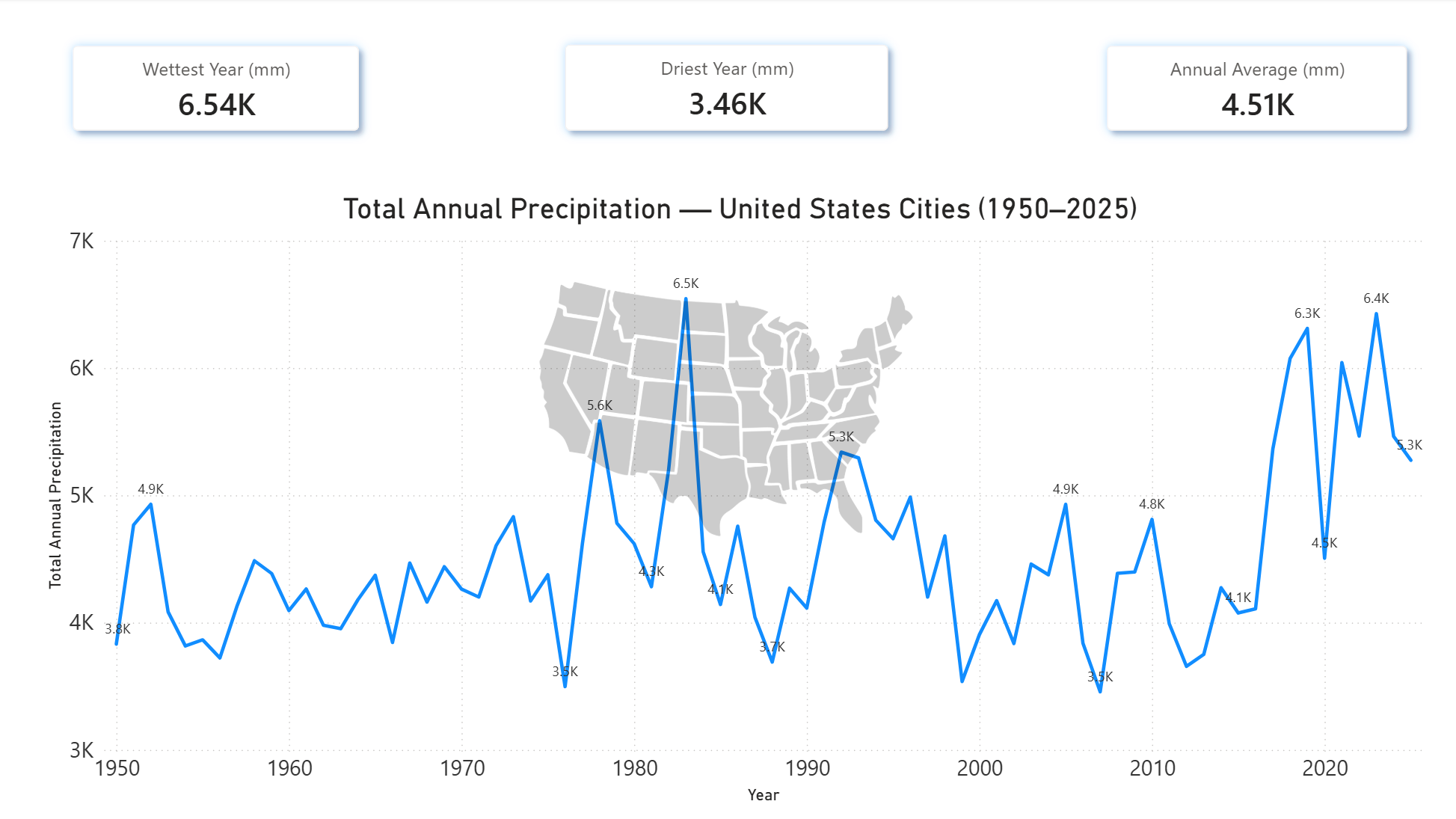
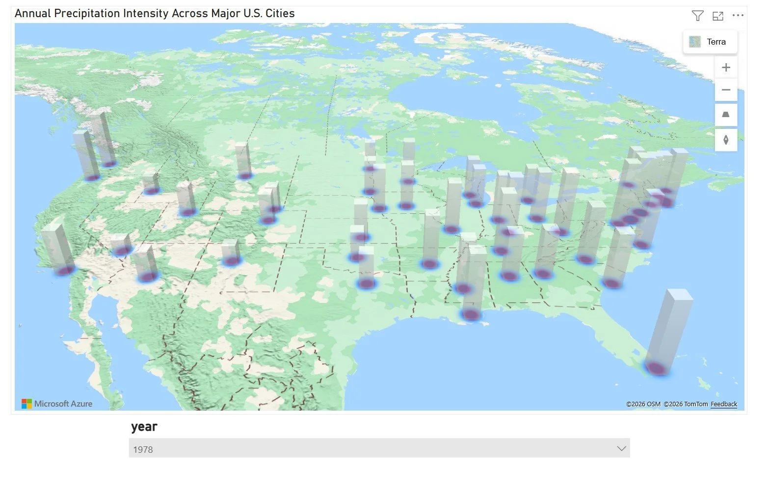
Scaling from a single city to a national view, this Azure Maps 3D column visualization compares precipitation across 48 major U.S. cities. Column height represents rainfall intensity, making regional differences immediately visible—from the arid West to higher-precipitation areas along the Gulf Coast, Eastern U.S., and Pacific Northwest.
The 3D approach provides a clear spatial comparison of rainfall magnitude while preserving the geographic context of each city.
Portfolio Note: The original Power BI dashboards were developed as interactive visualizations. Because public Power BI embedding requires additional Microsoft licensing, this portfolio presents exported screenshots of the completed dashboards rather than maintaining a paid embedding subscription. The underlying datasets, ETL workflow, and supporting project files are available through the linked GitHub repository.
Global Precipitation & Urban Ranking (ArcGIS & Power BI)
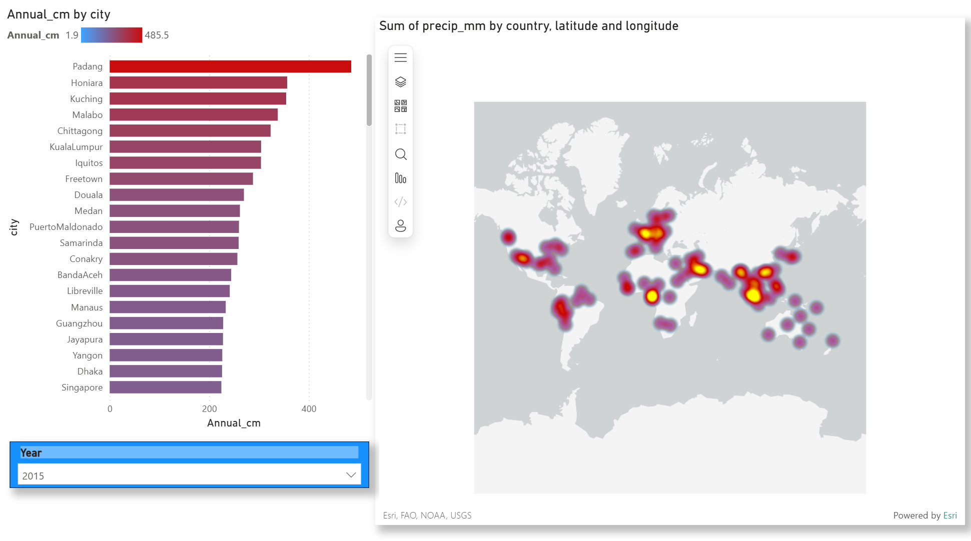
The final stage of the pipeline expands to a global dataset. Using ArcGIS integration, this heat map identifies worldwide 'hot spots' of rainfall. Paired with a dynamic year-slicer and a ranked bar chart, this ArcGIS-integrated dashboard enables users to filter by specific years (such as 2020) to see how urban centers like Seoul and Taipei compare to global averages in real-time. This allows for a deep temporal analysis, revealing how these cities consistently maintain their status as top-tier rainfall leaders over several decades.
Conclusion: Data-Driven Climate Diligence
The insights generated through this pipeline—from localized Tucson trends to global urban rankings—highlight a structural shift in how climate impacts economic systems. Increased flooding and heat intensity are no longer isolated weather events; they are emerging as primary economic drivers.
Arizona’s 'New Normal': Tucson’s ~400% precipitation variance reflects a broader regional trend. Arizona is experiencing increasingly extreme heat cycles and prolonged drought conditions, placing pressure on water resources, energy infrastructure, and a multi-billion-dollar agricultural economy.
The Global Supply Chain (The Coffee Effect): These patterns extend directly into global markets. In 2025–2026, extreme weather has disrupted key agricultural regions worldwide—driving significant volatility in commodities like coffee, cocoa, and staple crops. Brazil’s declining coffee output, West Africa’s damaged cocoa harvests, and reduced wheat yields in Europe have tightened global supply and driven price surges exceeding 100% in some markets. These disruptions are no longer theoretical—they are actively reshaping pricing, availability, and trade flows across the global food system.
Insurance & Land Valuation: Climate volatility is redefining risk at a structural level. Insurance premiums in high-risk regions have surged—sometimes exceeding 100% increases—while insurers begin withdrawing coverage altogether. This creates a cascading effect on land value, investment decisions, and long-term development viability.
The Takeaway:
This pipeline—spanning Python-based data cleaning, Azure-based staging, and analytical visualization—demonstrates how raw environmental data can be transformed into actionable intelligence. The goal is not just to analyze past trends, but to equip decision-makers with forward-looking insight into emerging economic risks driven by climate instability.